When today’s business users face important decisions, they look for new ways to get data quickly and easily in a modern format. This could mean building a report, an Excel spreadsheet, or a data-enriched dashboard. Whichever format they choose, users need accessible, up-to-the-minute information to make better business decisions.
Many Query/400 users spend too much time trying to manage existing queries, from modifying old ones to searching for the right one just to get basic data. SEQUEL can make this process much faster and easier. Let’s review three of the most important ways SEQUEL can help simplify and modernize your data:
- Easily view results with subtotals
- See data in Excel spreadsheets
- Create user-friendly dashboards
View results with subtotals
With SEQUEL, subtotals are very easy. You can include the subtotals within the view definition or have users summarize the data or change the totaling on the fly. Users can choose to return a quick count, summarize, or even find the average within a few clicks.
SEQUEL views can access data like Query/400, but SEQUEL makes it easy to add KPIs (key performance indicators), run-time prompts, subtotals, and grand totals. With SEQUEL, you do NOT have to create a report to include grouping and subtotals.
In design or outside of design, you can include the subtotals and grand totals. Simply click on the subtotal icon from your display results as follows:
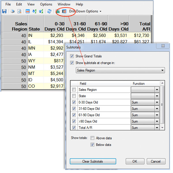
Figure 1: Click the subtotal icon to include in your view.
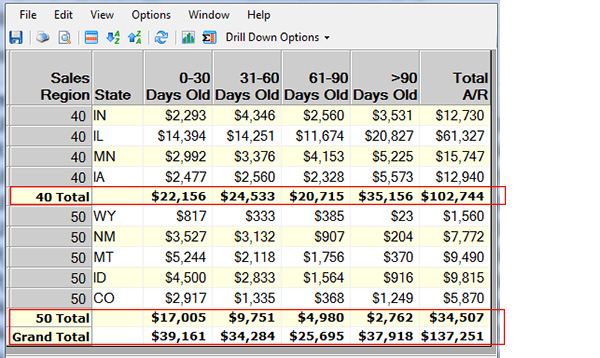
Figure 2: Subtotals and grand totals are included in this view.
If you’re displaying the results of a saved view from the design window, you can choose to save the subtotals option with the view definition. Thus, when a user runs the view, the subtotals will be included with the displayed results automatically. Users can also dynamically remove or include more subtotal options on the fly if needed.
Clicking on a column (such as Total A/R in the example below) performs a Quick Sum on the displayed view results, instantly providing a count of records and the total sum.
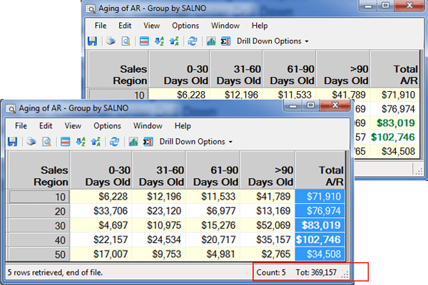
Figure 3: The user clicked on the Total A/R column to see a count of records and the total sum.
See data in Excel
Seeing your data in an Excel spreadsheet, PDF, and other document types is simple, either on-demand or from a scheduled job. SEQUEL’s modern results can be generated from an IBM i (iSeries, AS/400) menu option, a scheduled job, and from a PC with SEQUEL ViewPoint or in a browser with SEQUEL Web Interface.
Creating a scheduled job entry on IBM i is very easy with ViewPoint. As shown below, right click on the SEQUEL object (i.e., AR view) and, depending on your desired output, you can immediately display results in Excel, save results, or email an Excel spreadsheet as an attachment. The save results and email options can also be scheduled for your preferred date and time.
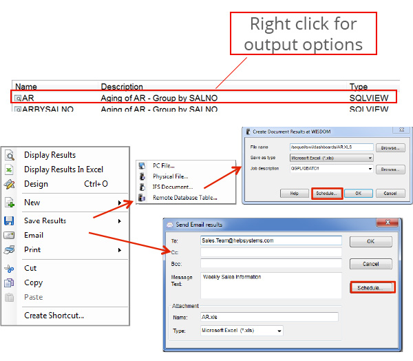
Figure 4: Schedule your data to be emailed in an attached Excel spreadsheet.
Create modernized dashboards
Dashboards show you the big picture, enabling you to make informed decisions based on real-time data. SEQUEL’s dashboards also let you consolidate data, whether it’s on IBM i, SQL server, or other databases.
By graphically displaying KPIs on dashboards, you can quickly identify which areas of your business are not meeting performance metrics and drill into the data for more details with a just a couple clicks. Graphs and gauges can be used to show data trends and compare current data against goals.
Users can securely access business information relevant to them from a PC, browser, or mobile device. Dashboards auto-refresh, so you see up-to-the-minute data wherever you’re accessing it from.
Creating a dashboard is easy. From SEQUEL’s graphical interface, simply select the option to create a SEQUEL dashboard (see images below). Select insert to add SEQUEL objects, action buttons, graphics, and gauges. Rearrange and size the objects to fit, and then save the dashboard. See a couple dashboard examples running from a browser window below.
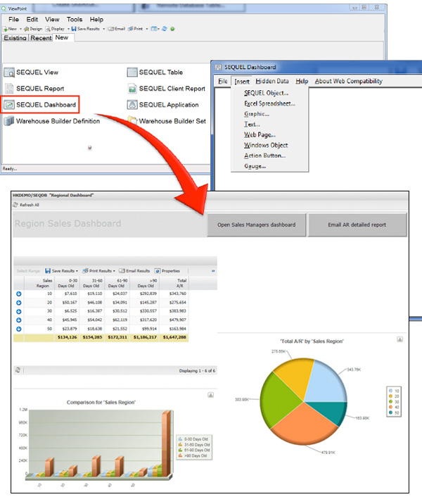
Figure 5: A few clicks is all it took to create this Sales by Region dashboard with grand totals, charts, and action buttons.
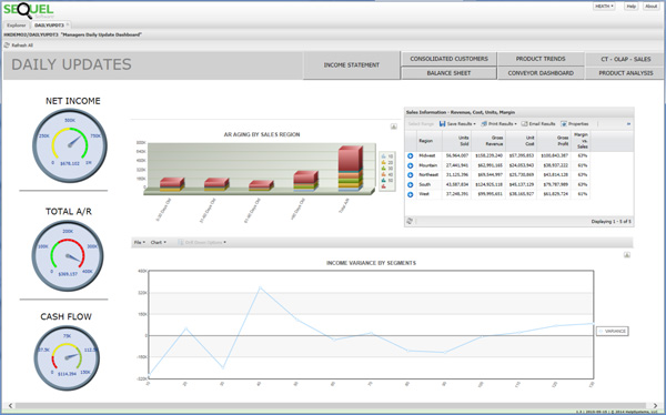
Figure 6: This is another dashboard running from a browser window. It includes gauges, charts, action buttons, and data with drill-down options.
With SEQUEL, you don’t have to waste any more time, effort, and resources fumbling with old queries. You can view current, accurate, and meaningful data in a modern way and it’s easy to make useful information accessible to the users who need it, when they need it, and how they need it. Try SEQUEL today to see what a difference it can make in your organization.