It’s true: getting access to your IBM i data is critical. But it’s just as important to be able to analyze data effectively once you’ve accessed it and use data to glean information. That’s where dashboards come in.
Dashboards, sometimes called executive dashboards or business intelligence dashboards, give you the ability to analyze data and make informed business decisions quickly. You can also use dashboards as a “menu” to give users access to data from a browser environment.
With Sequel Data Access, dashboards are intuitive and quick to build, so you can make important decisions faster. Plus, Sequel makes it easy to view dashboards on your PC via the GUI (Sequel Viewpoint) or web and mobile devices via the browser (Sequel Web Interface/Sequel Web Server).
To make the most of your Sequel dashboards, be sure to follow these best practices for:
- Formatting dashboards—without the fuss
- Visualizing data—the way you want it
- Delivering data—at the click of a button
One quick rule: Before you get started, keep the following rule in mind. Don’t let your dashboard get too busy or cluttered. Putting too many objects on a dashboard hinders decision-making, when your dashboard should help you make decisions quickly and easily.
Formatting Dashboards—Without the Fuss
Most importantly, you want your dashboard to be clean and organized. It should be straightforward so you can focus on assessing the information, rather than getting distracted by the formatting. Before creating your dashboard, it’s important to determine your goal and the dashboard’s audience. That way, you can ensure the dashboard fulfills those needs while you build it.
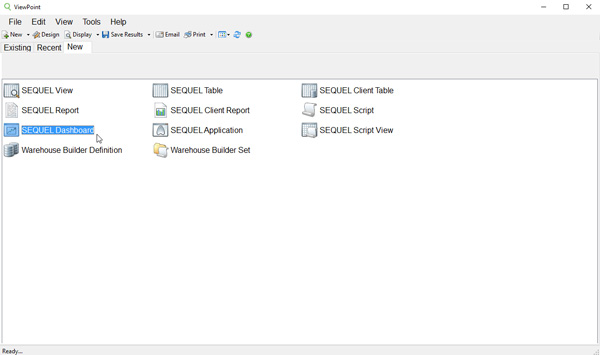
First, click on Sequel Viewpoint. Then, select Sequel Dashboard.
Right-click on the screen to select properties and select the workspace color. Choose a neutral color for the background, like white.
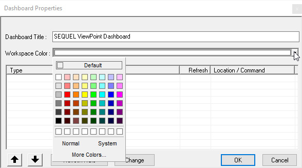
Next, you can customize your dashboard. Insert text to add a title. The dashboard title should relate to the data it represents and may be a location or a company name or branch, i.e. Financial Bank ABC, Daily Sales, Inventory, Patient History, etc.
Choose a font that is web-friendly, like Verdana or Times New Roman. Adding your company’s logo or matching font colors to those of your company is a nice—and often popular—touch. Just remember not to get too carried away with font colors—it's best to limit color choices to 2–3. It's a best practice to keep your dashboard uniform and consistent.
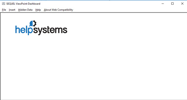
Now that you have the basics in place, you’re ready to bring your data (your Sequel objects) into the dashboard. Sequel objects you might choose from include views, reports, and tables. To add your data, simply click Insert. Select what you want to insert from:
- Sequel object
- Graphic
- Text
- Webpage
- Windows object
- Action button
- Gauge
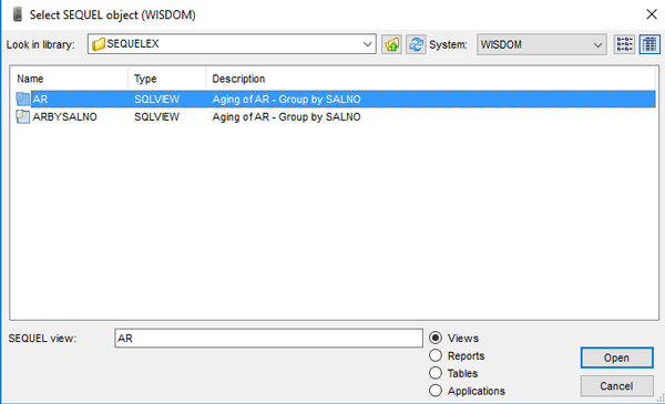
Choose Sequel object and find the view (or other object) you would like to put behind your dashboard.
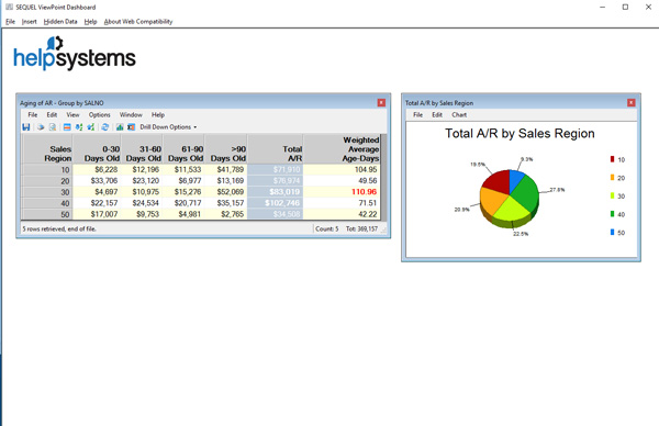
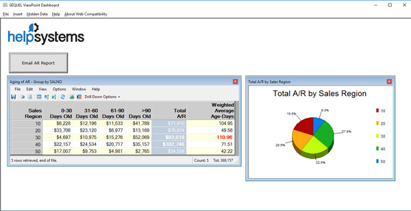
Your data will appear on your dashboard in rows and columns, with the details you need. You can even drill down into the data for further details. Most importantly, you can use the data in this object to power everything else on your dashboard.
Visualizing Data—The Way You Want It
Every dashboard should include a visual representation of data. Depending on your specific needs, this might be a gauge, a graph, or even a chart. Any of these options is a good way to emphasize key data and get value from the data. For instance, you can use a gauge, graph, or chart to measure key performance indicators (KPIs).
To add your visual element of choice, simply highlight the data you want to use and select which object you’d like to add. In this case, let’s say you want to see your data in a graph. After you’ve highlighted the data, click Insert and select the graph option. Then, place it on the dashboard.
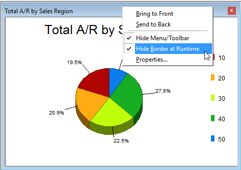
Click on the toolbar to customize the graph to your company’s needs. For instance, change colors or narrow your data selections. Define a title, move the legend, or add text to give your graph additional context. Hide the toolbar, too, if you wish when finished.
To keep your dashboard looking sleek and clean, it’s a best practice to hide the border. This gives you additional space and keeps the dashboard from getting cluttered.
Deliver Data—At the Click of a Button
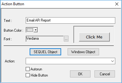
Adding an action button to your dashboard is a best practice for safely delivering data to users on demand. To insert an action button, click Insert again and select action button from the list.
Add text indicating what the action button will do, for instance, Email AR Report. Then click Sequel Object to select which set of data you want to be delivered by the button.
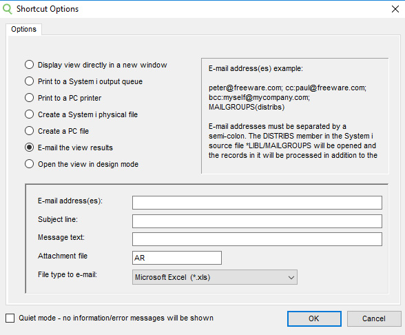
Next, define “Shortcut Options,” to determine what action you want the button to take:
Finally, place the action button where you would like it to appear on the dashboard.
Remember: you want to maximize the white space and make sure that everything is lined up neatly.
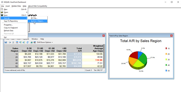
Bonus tip: Be sure to save your dashboard as a System i object. By doing so, you’ll prepare the dashboard for distribution and incorporate your trusty IBM i security. That way, you’ll even retain IBM i security when accessing the dashboard through a browser (i.e. Sequel Web Interface). If you were to save your dashboard as a PC file, it would only exist as your personal copy—no one else would be able to see it.
Summary
When you follow our best practices for formatting dashboards, visualizing data, and delivering data, you’ll create clean, organized dashboards that are simply for anyone to understand. And analyzing data will be quick and easy—setting you on the path to making informed business decisions faster.